

A eco-friendly clothing store providing fashion that can stand the test of time.
Role: UI/UX Designer and UX Researcher | Tools: Figma and Adobe Suite | Project: Responsive e-commerce website | Timeline: 4 weeks (80 hours)
Classic
Classic is a eco-friendly urban lifestyle clothing store. It is based in Los Angeles and started in 2007. Classic has been thriving in Southern California, but after being a brick and mortar store for over a decade, it wants to take its business online.
Problem
There are many online clothing stores that each provide a different experience. Classic wants to provide a competitive experience with the current market but lacks a strong online presence. They have a large inventory of clothing and want the demand of their clothing to grow beyond Southern California.
Solution
After research and interviewing how to rebrand Classic. I designed a responsive website that focus on the customers while being a eco-friendly brand.
-

A brand that treats nature with kindness
I designed a landing page that focus on the eco-friendliness of the brand.
-

Clothes that impact the environment
Customers would know what their environment impact for each clothing.
-

Brands that use eco-friendly materials
Clothing that focus on both fashion and impact.

Research
Pre-Research
To get a better understanding of the e-commerce business, I had to understand what e-commerce was. Then I would do market research and competitive analysis of the competitors. The research would help me understand Classic’s goals and the target audience. Finally, I interview with some participants to understand how customers shop online.
Market Research
I researched the market trends in the e-commerce business. I analyzed customer’s needs and market drives.
150 million people shopped online for the first time during the pandemic
Constantly have your brand evolve and adapt
According to Shopify, there was 10 years of e-commerce growth in 90 days.
Checkout experience is crucial
Competitor Analysis
I compared a couple popular online stores that has a strong online presence. I analyzed their strengths and weaknesses. Most of these stores have great shopping experiences but they also have too much going on that could overwhelm customers. I also wanted to understand what they were solving.

Click to see the competitor analysis in full size
1:1 Interviews
For me to understand how customers shop online, I interviewed 4 people. From the interviews, I focused on what makes a “good versus bad” shopping experience.
I recruited users who were:
Age: 21-30 years old
Occupation: Student and Professional
Shop: At least a couple times a year online
I focused on these research questions to help guide me:
What are customers’ experience when they are offered a variety of clothing choices?
What are some reasons why customers still shop in-person?
Why do customers choose one online store over another?
What type of experience do customers have when they shop online for clothes?
What do customers want in clothing when they shop online?
Insight
From the interviews, I discovered a lot about customer’s experience with online shopping. After analyzing the interviews, I found the needs and pain points that participants encountered.
Need
Organized website that is easy to navigate
Clothes that has reviews with comments and images
Sorting/filtering for clothes
Wear the clothes before purchasing
Brand that is sustainable and eco-friendly
Pain points
Website that is messy and not organized
Return and shipping cost money or is difficult
Images of clothing with no model
Too much advertisements for clothing
Persona
Meet Jake Brown, he is a trendy guy in the tech industry. I created him based on my research and interviews. He will help me with my design decisions.


Define
Empathy Map
The empathy map helped me convey what Jake experience when he shops online for clothing.
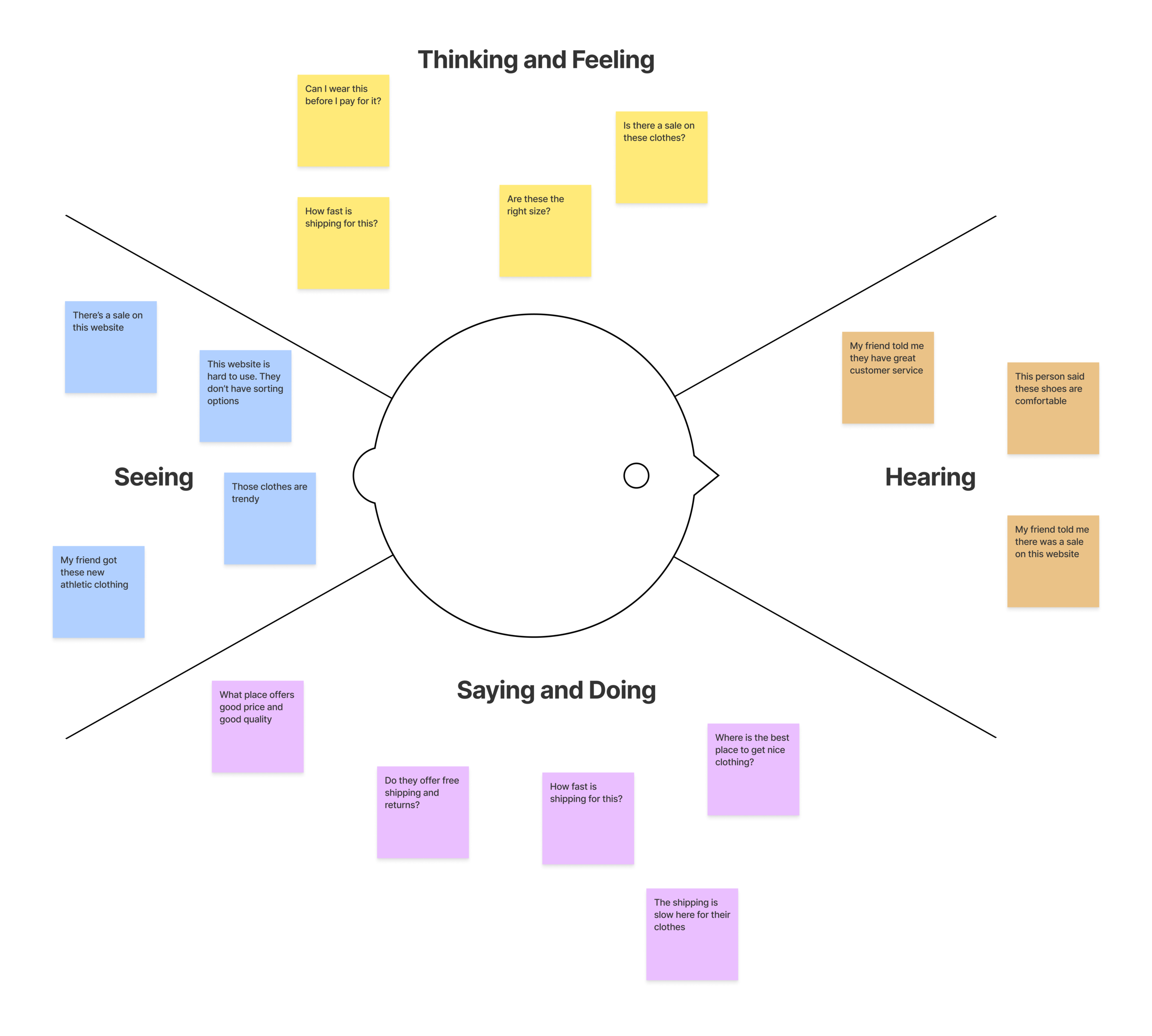
Click to see empathy map in full size
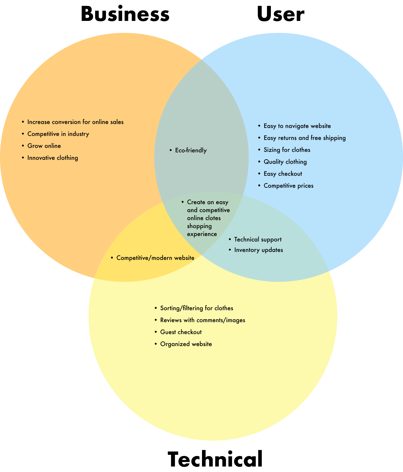
Project Goals
I defined the problems that Classic would need to solve for its customers’ needs. I wanted to make sure I was solving the right problems and not just problems that I assumed. I created a diagram for Classic that outlined the different goals from the Business, User, and Technical side.
Card-Sorting
Classic has a large inventory of clothing and the architecture of the site needed to be organized. I looked to card sorting to help me solve this. I recruited a couple participants and gave them a list of clothes and told them to organize/group it however they like.
Card Sort Type: Open-Card Sort
Number of Cards: 20
Tool: Video Call
Participants: 5
Insight
Participants like to put things under subcategories
Some participants had different definitions of clothing
Sitemap
I created a sitemap based on the card-sorting of how Classic’s website should be structured.

Task Flow
I created a flow for a task Jake could do on the website.
For Classic, Jake would do the following task:
Go from the home page to the jacket page
Select a jacket (size and color)
Checkout

Click to see the task flow in full size
User Flow
Next, I made a user flow which was more complex as there were more flows Jake could take. Jake had more options to do on the website. These are the many flows that Classic would have for its customers.
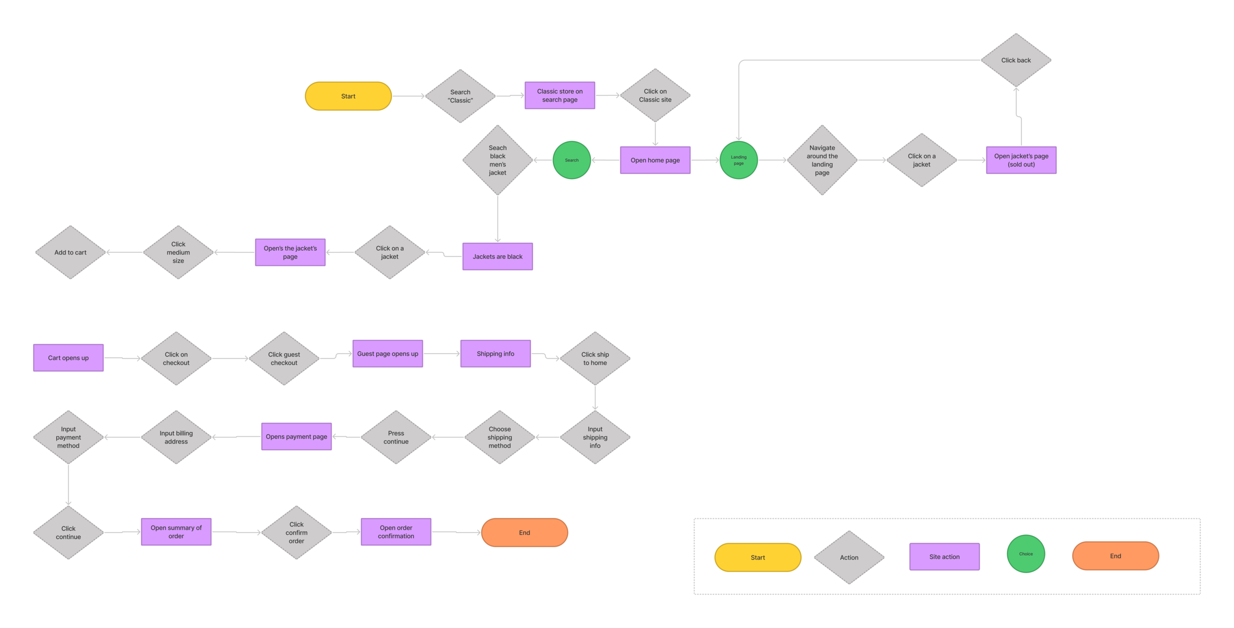
Click to see the user flow in full size

Ideate
Wireframe
Before I went to the UI for the website, I made low-fidelity wireframes that organized the hierarchy and structure for Classic. I used my interviews and research to help me create the wireframes. I focused on the customer’s needs and Classic’s needs. Next, I will rebrand Classic.
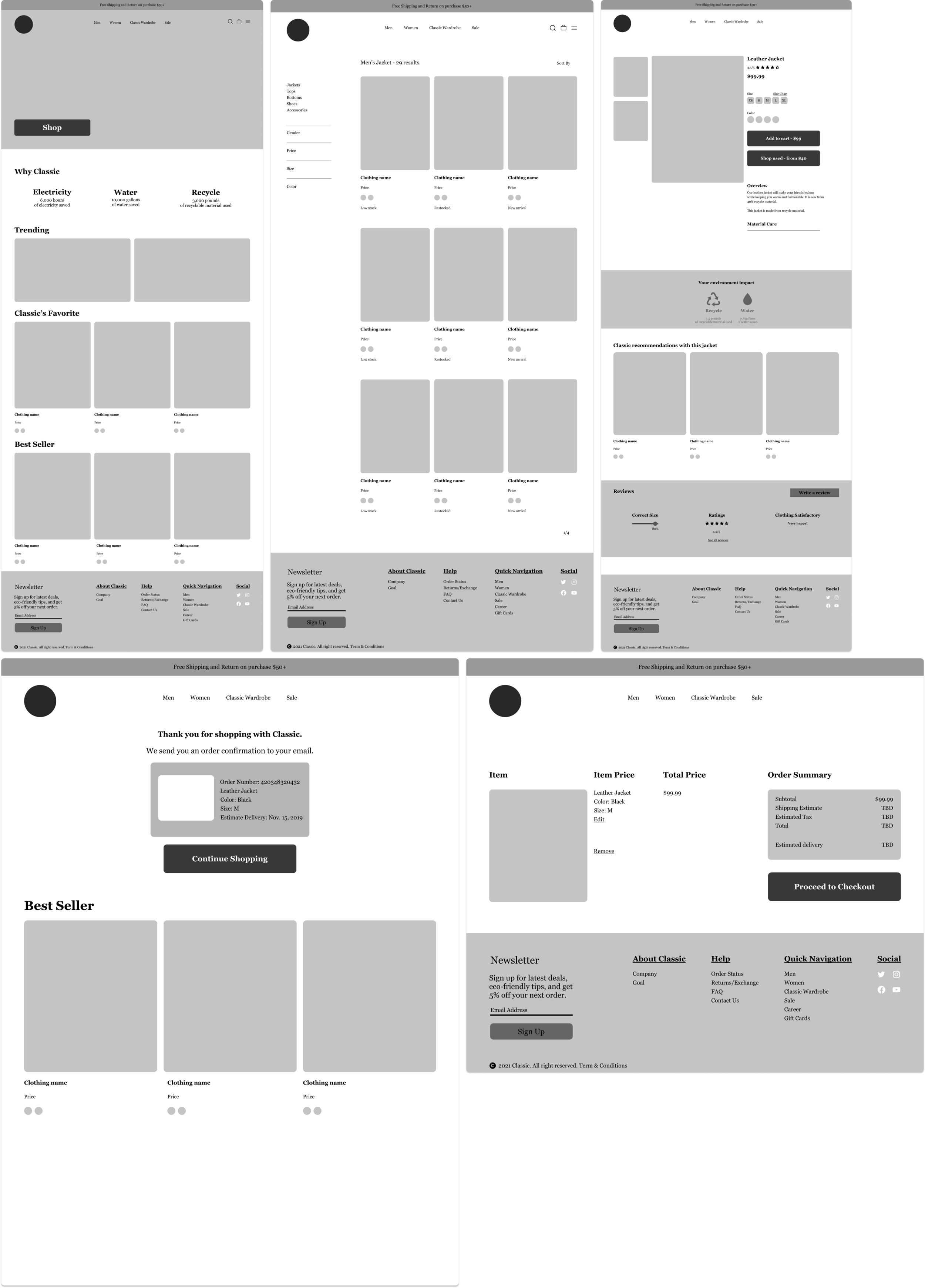
Click to see wireframes in full size
Branding and UI Kit
I created a couple variations of Classic’s logo. But what does Classic mean? To me, it means something that can stand the test of time. So I took some inspiration from the Greeks. Also, since the company was eco-friendly I designed a tree bush to represent that. From there, I made a style tile and UI kit for the different components I used throughout Classic’s website.


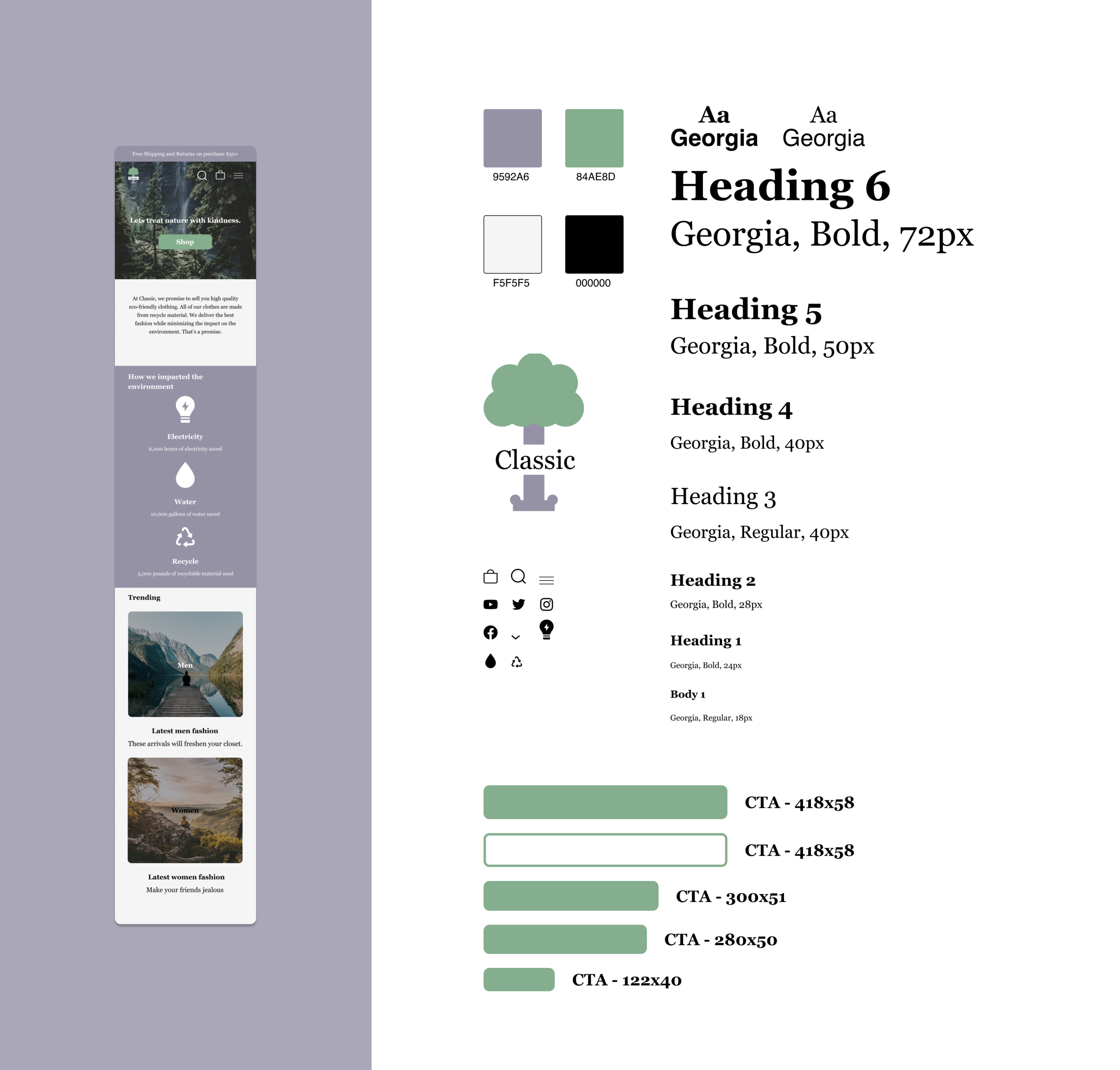
Click to see UI kit in full size
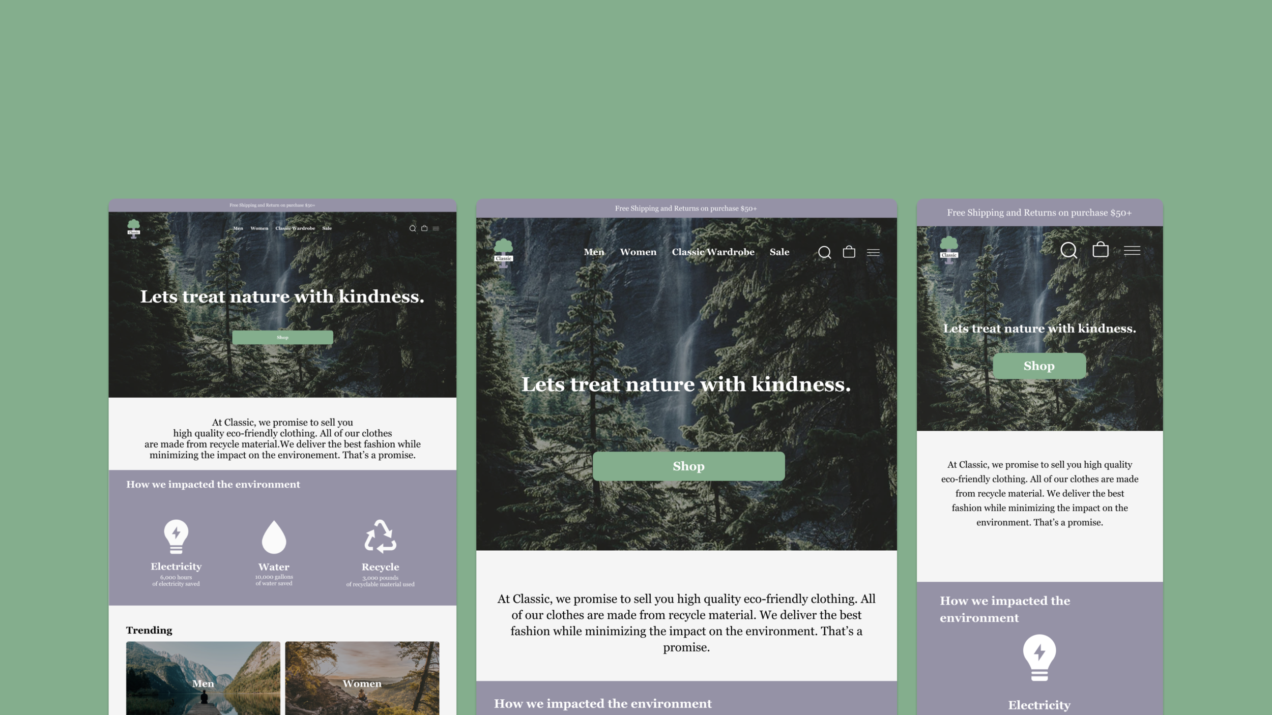
Mid Fidelity Mockup
I added the content, imagery, and styling. Mixing a blend of nature and fashion, Classic rebranding is born. I will use this to conduct the usability test.

Click to see mid fidelity in full size

Prototype and Test
Usability Testing
I recruited 5 participants and testing the prototype with them. After I gave them the task, I observed them to test my hypothesis for the website.
Assumption:
Classic website would offer an competitive shopping experience due to the easy shopping flow, navigation, and organized structure.
Hypothesis:
Customers would be able to use Classic’s website easily if the shopping flow is easy and doesn’t overwhelm them.
Objective:
Users can navigate website without being overwhelmed
Figure out pain points and visual issues that users may have when they use the website
Users can add clothing to cart and checkout
Figure out if there can be any further improvements
Method:
Video Call
Think-aloud
Insight
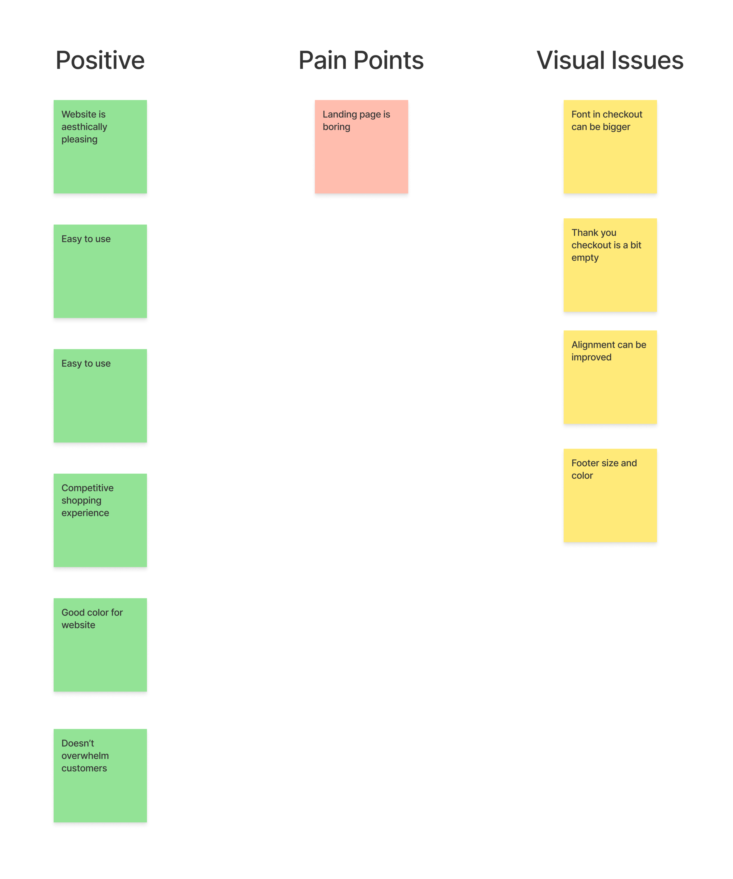
After the usability test with the participants, I was able to figure out some of the positives and improvements for the website. I was able to test my hypothesis and that all the participants agreed that the website was easy to use. There were some small frustration points and aesthetic issues.
Affinity Map
From the usability test, I synthesized the positives, pain points, and visual issues to make an affinity map. I will use these to make an iteration for the website.
Revisions
Since a lot of participants said that the landing page was boring, I decided to spice things up. I add a core promise that focused on them being a eco-friendly company. I used visuals for how they impacted the environment. Also some participants said they don’t know what to purchase sometimes, so I added a quiz that would help with that.

Click to see iterations in full size
Summary
I am satisfied with how the project turned out. This e-commerce project helped me understand the importance of research from customers, competitors, and market trends. I was overwhelmed during the UI part of the project. I spent too much time trying to make it perfect. In the future, I would iteration more. I was able to create a website focused on the customer’s online shopping experience. I didn’t create a website that I assumed customer’s wanted but rather on what they needed. For my next projects, I would spend more time recruiting participants and practice more of my UI skills.
Next Steps
I want to improve the website by adding more content because some parts of the website felt empty. For this project, I focused on usability and research.
After the revision, I want to do another usability test.
Handoff to developers so they could get started on creating the website.
Deliver to Classic and let them bring their business to more than just Southern California.