
Yitty
Redesigning the homepage to enhance the holiday shopping experience for 2 million VIP members.
Role: UX Designer | Platform: Website and Mobile | Tools: Figma | Timeline: 8 weeks


Context
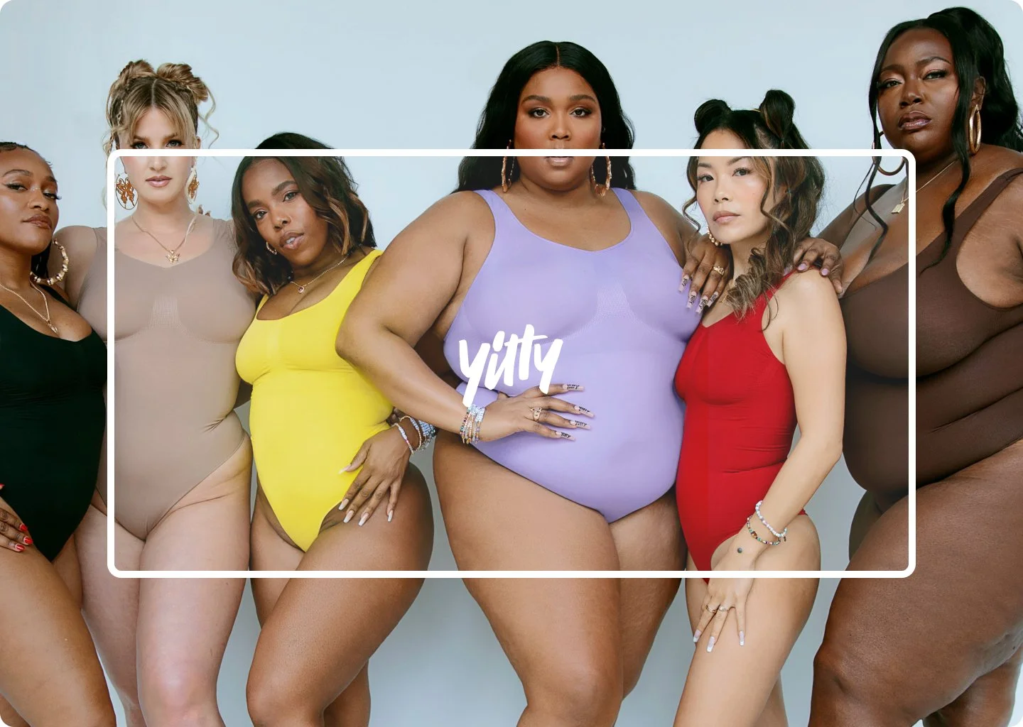
Yitty is a shape-wear brand co-created by Lizzo. It focuses on being revolutionary and having shape-wear that is designed for all body types.
Problem Statements
The primary problem faced by Yitty was that their existing homepage was not optimized for the holiday shopping season, which led to several issues: High bounce rates, low conversion rates, and overwhelming choice.
Solution
To address these challenges, we did a comprehensive redesign of the homepage tailored specifically for the holiday season. The solution encompassed several strategic and tactical changes: Theme selection, simplified navigation, membership education.
Design process
I anticipated numerous business requirements, constraints, and objections, given that the homepage is the first thing customers see. We held workshops with key stakeholders topic off the project to establish our business vision, goals, and challenges. Once we clearly understood the stakeholders’ expectations, my project manager conveyed the requirements via Jira. I also consulted with our software developer to determine any feasibility constraints.
Research
The stakeholders wanted the Yitty homepage to have a similar look and feel to Fabletics while remaining competitive with our other competitors. To achieve this, I audited Fabletics’ iteration and researched competitors like Lululemon, Skims, Nike, and Adidas for inspiration. After synthesizing my research, I met with my team to discuss our approach before commencing the design iteration. We created wireframes for desktop and mobile experiences, which we presented to stakeholders for feedback. The stakeholders advised us to focus on conveying our products while simultaneously telling a story and explaining our membership program concisely.
One issue that caused some frustration was the promotional banner at the top, as stakeholders had differing opinions on its design. This delayed our timeline, but my project manager supported my vision and pushed for the iteration I favored. Eventually, we reached a compromise that satisfied all stakeholders.

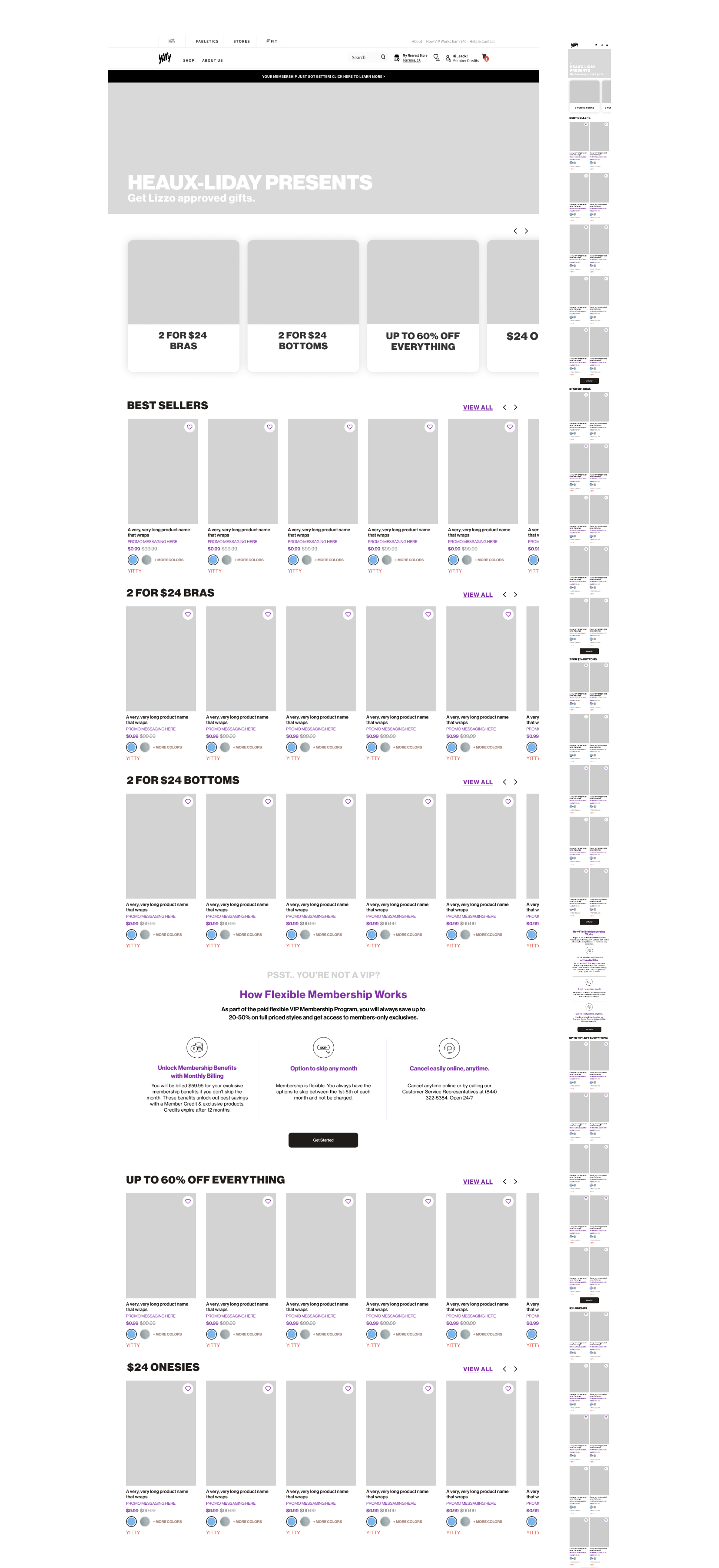
Wireframes
We created wireframes for desktop and mobile experiences, which we presented to stakeholders for feedback. The stakeholders advised us to focus on conveying our products while simultaneously telling a story and explaining our membership program concisely.
One issue that caused some frustration was the promotional banner at the top, as stakeholders had differing opinions on its design. This delayed our timeline, but my project manager supported my vision and pushed for the iteration I favored. Eventually, we reached a compromise that satisfied all stakeholders.


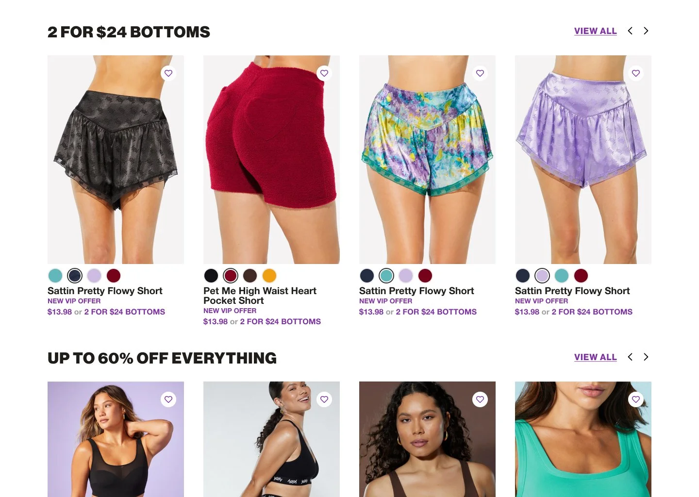
High Fidelity Mockup
Following our design system and working with the creative team, we delivered the holiday edition of the Yitty homepage.


Metrics
Post-launch data showed a 30% decrease in bounce rates and a 45% increase in conversion rates compared to the same period last year.

Reflection
This project was a significant undertaking, given that the homepage is customers’ first point of contact. However, I’m delighted that my project manager trusted me with this responsibility and provided me with another significant project. I learned that stakeholder objections are inevitable, and it’s crucial to comprehend their perspectives. Building solid relationships with team members can help achieve small victories when needed.