

Color. Wash. Repeat.
Role: UI/UX Designer and UX Research | Project: E-commerce responsive website | Client: The Colorspace Company | Timeline: 4 weeks (80 hours)

The Colorspace Company
The Colorspace Company was founded in 2020. It is a small business that markets washable coloring cloths. The company was created because an aunt was always surrounded by her nephews and nieces. The washable coloring cloth provides sustainable activities to reduce kids’ screen time. She hired me so I would research and design her a responsive website that would represent her brand and differentiate the business from its competitors.

Problem
The Colorspace Company is a small business that only has its presence on Etsy, Facebook, and Instagram. They need a website in order to implement SEO best practices and increase sales conversion. In this digital age, it is crucial to have a responsive website to compete as a business.
Solution
The Colorspace Company at its core is a e-commerce business so I focused on what would make it have an edge from its competitors. After researching and interviewing, I designed a responsive website for my client in order to take her business to the next level. I stayed within her branding and build upon it.
-

Conveying creativity and being a kid again
If you ever experienced that excitement when you went back to school with new supplies. That’s what I wanted to achieve when I designed the landing page.
-

Differentiating The Colorspace Company
I wanted to differentiate the business from its competitor. I designed with what made The Colorspace Company unique and special.
-

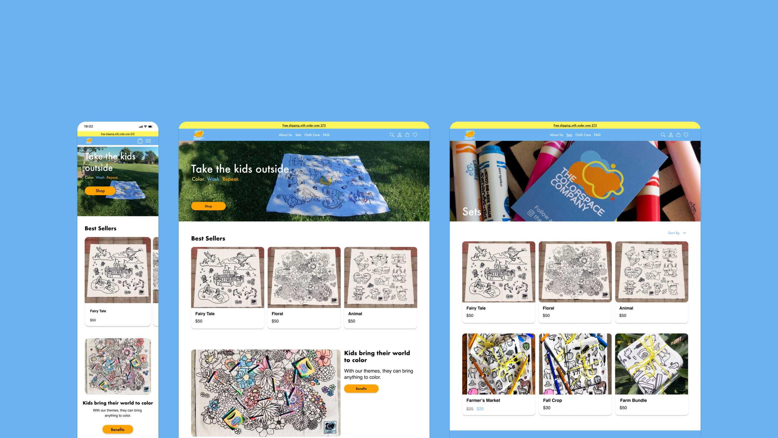
Browsing clothes fast and quick
I designed the website in a way that customers could browse for clothes quickly while looking at different designs and reviews.

Research
Pre-Research
Before I do any concrete research, I wanted to understand the coloring cloths business and what customers expect to see from a business like this.
I wrote a research plan that would guide me along the process.
Goals for research
Understand the e-commerce business
Identify the strengths and weaknesses of competitors
Identify what customers want from these coloring clothes
Understand what kind of story a coloring cloth business should convey
Understand the frustrations customers have from purchasing from a small online business
Assumptions
Customers would want a wide variety of cloth designs
Website has a tone that convey fun and kid-friendly
Reasons for having a website
It grows your brand
Create loyal customers
Fast checkout process
Cheaper than brick and mortar
Reach a lot of customers
Easy to update product
Better tracking analytics
Market Research
From my market research I was able to identify the trends in the washable coloring market
Washable coloring cloth is very kid-orientated
Washable coloring cloth is popular due to the fact that it is reusable
Crayola washable markers are usually recommended by each company for the best wash-off results
Most washable coloring cloth company are started by women/moms
Parents want to use the cloth as a way to get their kids away from the technology-driven age so they can be social with other kids
Competitor Analysis
To better understand how to create a competitive website, I sat down with my client and asked her about her competitors. She told me that there wasn’t much competition in this space but these two were her main competitors. I analyzed the competitors based on how I could improve their weaknesses while understanding their strengths. I focused on their branding, how they create trust with their customers, and the way they craft their story.

Click to see the competitor analysis in full size
1:1 Interviews
After gaining a better understanding of the market and the competitors, I talked to the audience who are in the market for washable coloring cloths. I used open-ended questions in order to get answers in detail rather than yes or no answers.
I created an interview guide to help me conduct the interviews.
I interviewed individuals who are teachers, parents, or family relatives. I wanted to understand the reasoning for why they chose washable coloring cloths when there were so many other options to entertain kids. Also, I wanted insights on their experience from the competitors.
Participants: 5
Age: 25-35
Empathy Map
From the 1:1 interviews, I created an empathy map and separated each category into “Say, Think, Does, and Feel.” This helped me synthesized the insights from each interview.
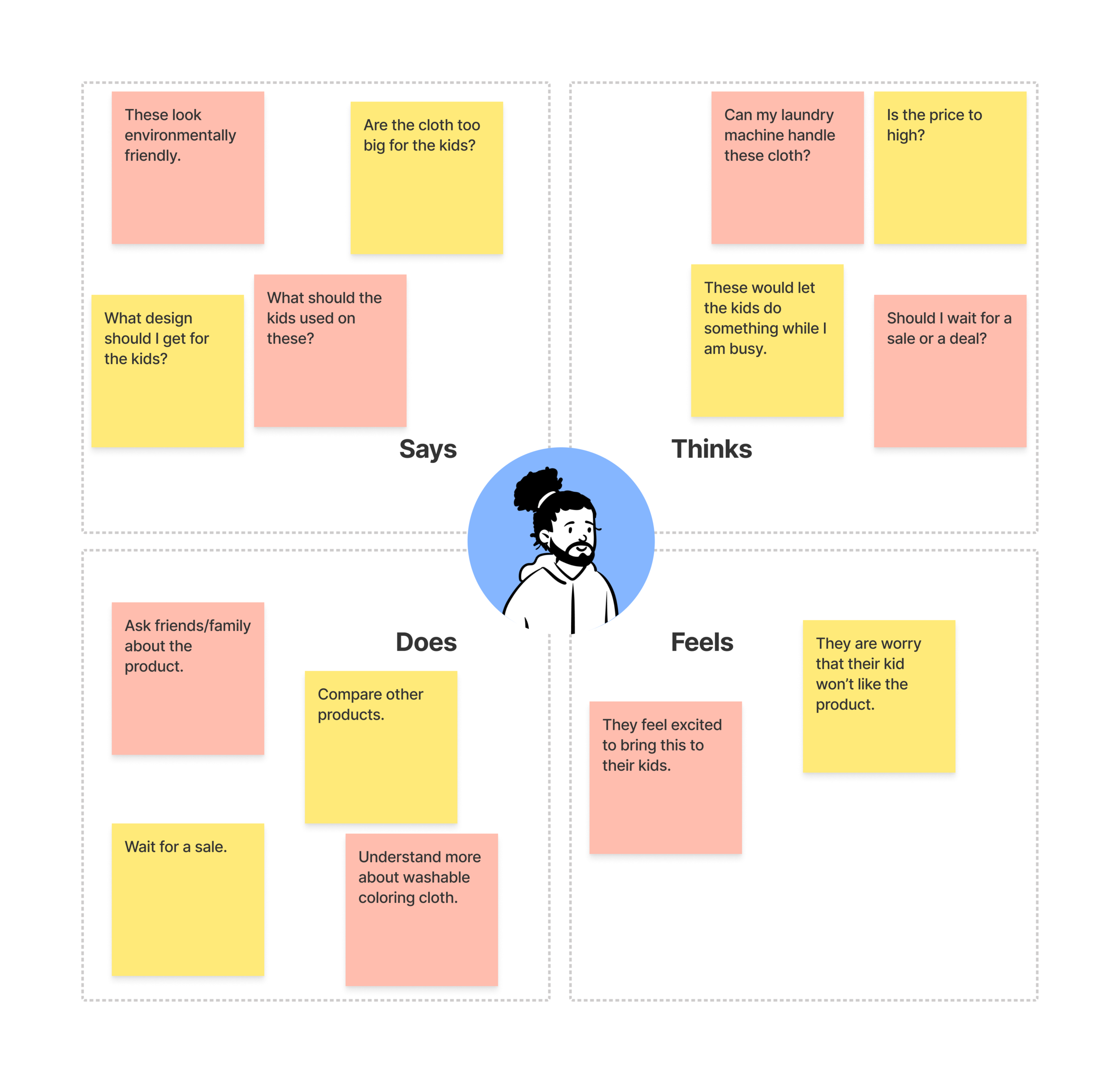
Click to see empathy map in full size
Insight
For the 1:1 interviews, I also told the participants to go on a couple competitors’ website and give me feedback on the functionality and tone.
2/5 participants wanted to know how big the cloths are
4/5 participants wanted multiple designs
2/5 participants wanted to know about the story behind the business
1/5 participants wanted to know what tool their kids should use on the cloths
I was surprised that many participants wanted the website to have multiple designs. A large washable coloring cloth would be a huge purchase for them and they wanted to be able to choose a design that their kids would love. They wanted the kids to be able to recolor it without being bored.
Persona
From the secondary research and primary research, I created a persona. This is Emma, she helped me as I moved forward with my design decisions.

Click to see persona in full size

Define
How Might We
With the research completed, it’s time to identify the problems. I created a How Might We (HMW), in order to brainstorm ideas.

Click to see the how might we in full size
Project Goals
After I synthesized the interviews, I created a diagram with the Business, User, and Technical goals for the website in order to see what overlaps.

Feature Product Roadmap
With the goals established, I prioritized certain features of the website. I talked to my client to understand what she wanted to prioritized. We talked about each feature and how it would affect her website.
What would help her sales and what were unnecessary towards her goal. I made a product roadmap with what she wanted to prioritize: Must Have, Nice to Have, Could Wait, and Don’t Need.

Sitemap
Due to The Colorspace Company not having a website, I had to create the sitemap from scratch. After I finished the sitemap, I discussed with her how I incorporated what she wanted throughout the website. I organized the website based on what was important to her customers and with a focus on usability and easy navigation.
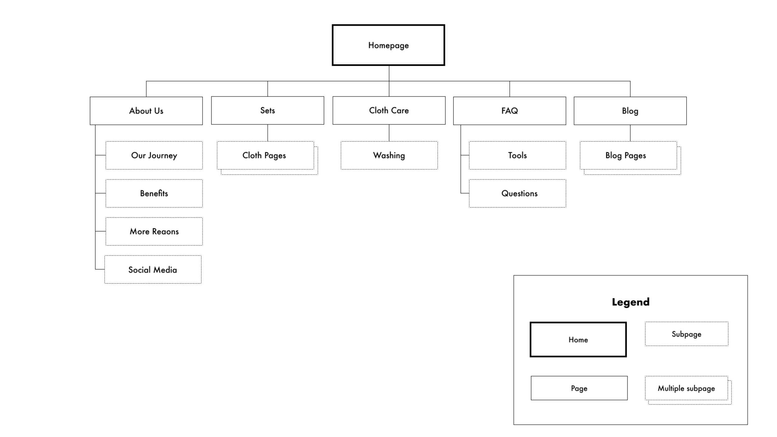
Click to see sitemap in full size
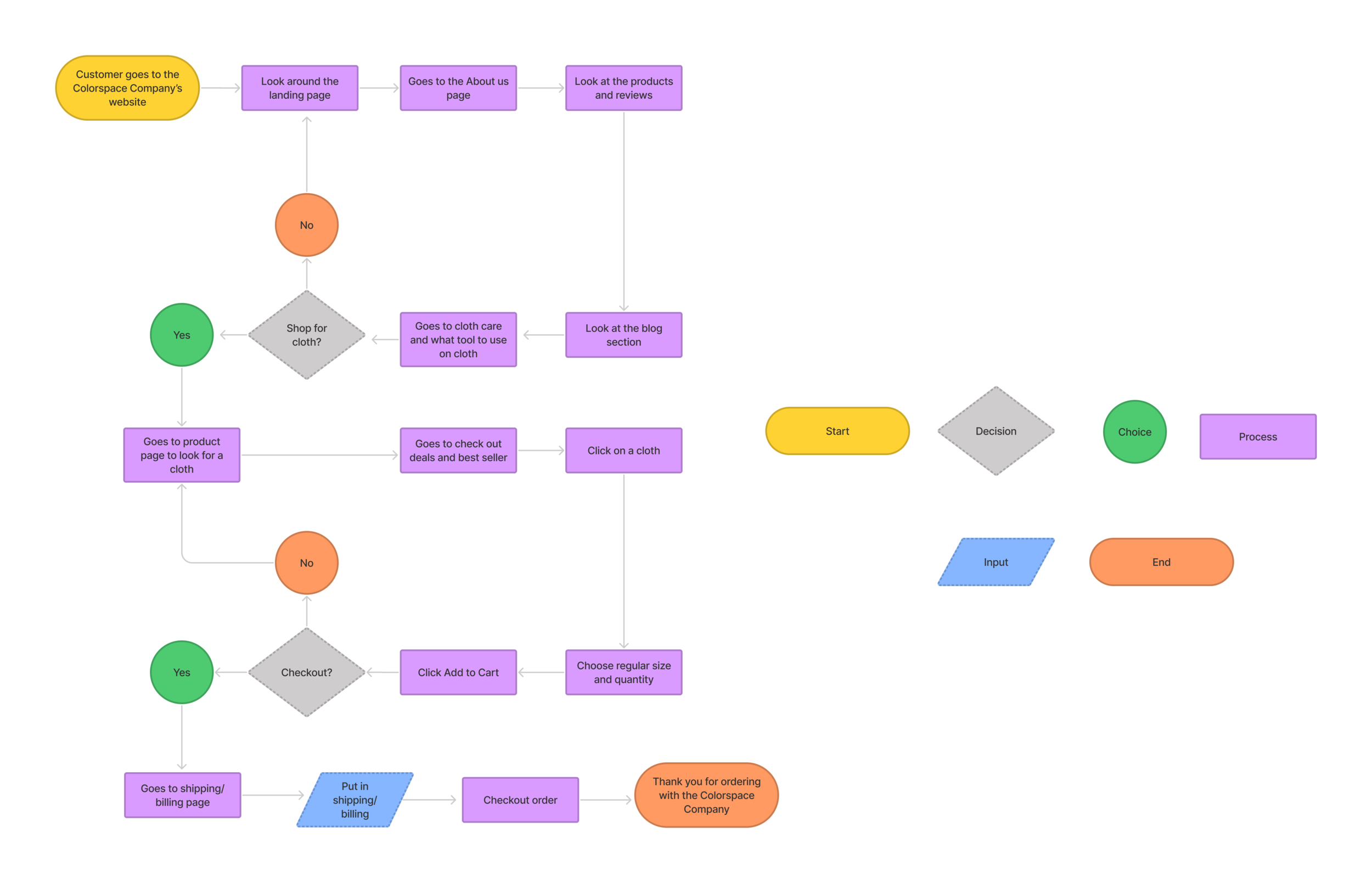
Task Flow
I made a task flow for what Emma would want to do on the website; choose a washable coloring cloth and checkout.

Click to see the task flow in full size
User Flow
For the user flow, it would be different scenarios that Emma could do. She could navigate on the website and explore the business before making a decision. There would be blogs and articles she could read about the washable coloring cloths. Once she is sold on the cloth, she could purchase it and checkout.
Click to see user flow in full size

Ideate
Wireframe
I researched on competitors and a couple of the best e-commerce websites to be inspired. I made sketches of the website before I digitalized them on Figma. I created a mobile and desktop version of the website. This was an early iteration. I got feedback from my mentor and peers that the landing page was too bland and there were too many steps in the checkout process.
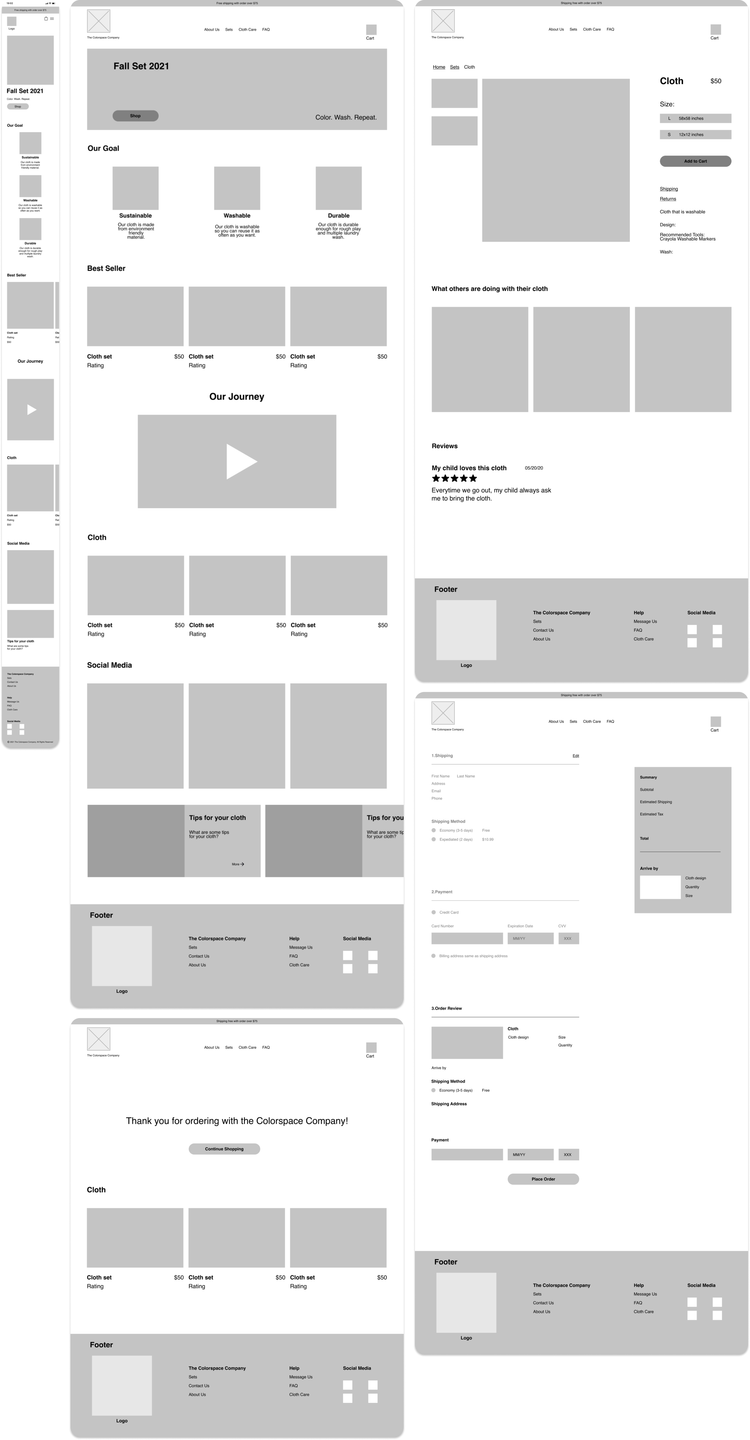
Click to see wireframes in full size
Branding
The Colorspace Company wants its customers to color, wash, and color again. Coloring with friends, family, or yourself to create endless memories. I talked with my client and how she came up with the branding in order to identify how I could improve it. My client wants her customers to feel relaxed. She wants them to be de-stressed while coloring.


Logo
I designed many variation of logos but my client already had a logo for her company. I got feedback from each logo design and this design was the most popular among participants.


Click to see branding in full size
UI Kit
I took into consideration the original brand colors based off client’s feedback and user testing. This was the color palette that many users felt represented the brand well. The color palette here is meant to inspire children through the use of color and imagination.

Click to see UI kit in full size
Mid Fidelity Mockup
Since I had the logo and UI kit finished, I “colorspaced” my wireframes. I focused on the screens that participants would use during the usability test: Home page, Product page, Checkout page, and Thank you page. This was the mid fidelity mockup of the website. I also made revisions from the feedback that I got.
From my research, client’s expectations, and participants the website I designed consisted of:
A welcoming home page that gives a tone of creativity and being a kid again
A story and reasoning behind why The Colorspace Company’s cloths are better than its competitors
A fast and easy checkout process

Click to see mid fidelity in full size

Prototype and Test
Usability Test
With the completion of the mid fidelity mockups, I conducted usability testings in order to understand what could be improved in future iterations.
I made a usability guide to help me conduct the tests.
Participants: 5
Length: 7-10 minutes
Method: Remote Video Call
Objective:
Understand the flow of the website
Identify the pain points
Identify the visual issues
Task:
Purchase a large animal cloth from the sets and checkout as guest
Affinity Map
I created an affinity map after I synthesized the data I gathered from the usability test. I divided it into different sections: What people liked, Visual issues, and Pain points. From here I would make a final iteration of the website.

Click to see affinity map in full size
Insight
4/5 participants said the text could be bigger in some area
3/5 participants said there should be an email receipt after the order
5/5 participants said the navigation bar is confusing
2/5 participants said the horizontal scroll for the blog was confusing
4/5 participants said some of the pages were bland
The navigation bar could be improved
Add to cart should be static and to disable the rest of the page
Horizontal scroll for the blog section could be improved
Thank you page is bland
Text size could be bigger
CTA buttons color blends in too much
Landing page could be improved
After I identified the pain points, I made insights on the revisions that I would prioritized
Revisions
These are the revisions I that my client wanted to be a priority before I continued with my design.
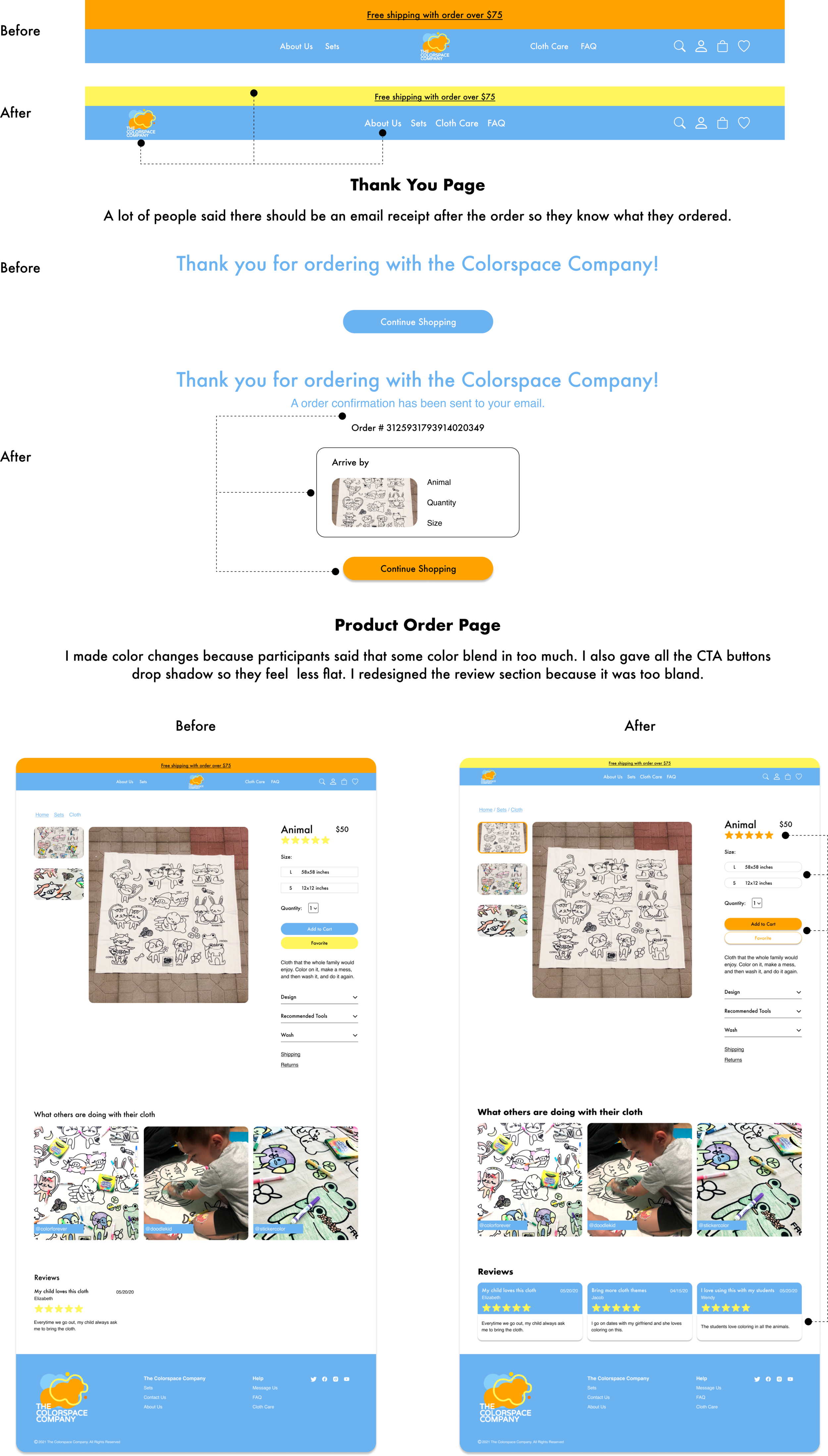

Click to see high fidelity in full size
Summary
This was my first project where I worked for a client. I was able to understand how to create a website with an existing brand. I made a lot of iterations and got a lot of feedback which helped speed up the process. My client was happy how it turned out as the website represented what The Colorspace Company was, while differentiating it from its competitors.
Next Steps
I would give the deliverables to my client
When my client is ready and her business is more stable, she would need to get developers to create her website
Handoff to the developers
Add more functionalities and features as the business grow
What to improve
I would spend more time recruiting participants because it was mostly my client’s customer. I didn’t get to have a broader spectrum of participants
Improve on the way I research for the market